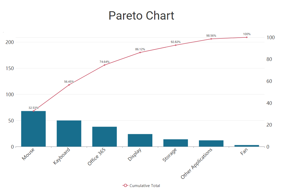
📈 Pareto Charts
A Pareto Chart is a graph that indicates the frequency of issues, as well as their cumulative impact.
They are useful to find the defects to prioritise in order to observe the greatest overall improvement.
Example
A Pareto Chart is a graph that indicates the frequency of issues, as well as their cumulative impact.
They are useful to find the defects to prioritise in order to observe the greatest overall improvement.